Pop Therapy
A college mock client project focused on developing a cohesive brand identity through meetings, asset creation, and design refinement.
Client Moodboard


The client initially provided a small moodboard but was open to creative adjustments and improvements. The color palette evolved from the original green and purple scheme to a more refined combination of brown and pink, with supporting secondary colors of green and light pink.


.png)

The History
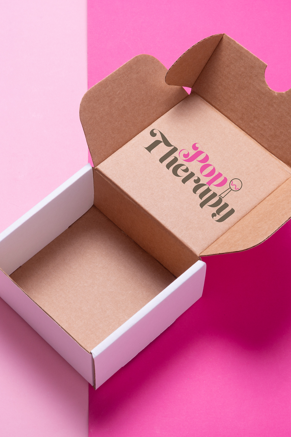
Pop Therapy began five years ago during COVID, growing from a home-based hobby into a thriving local brand with a spot in Place D’Orleans mall. The goal is to make Pop Therapy a full-time venture built around the mission, “A flavor for every mood.” The brand embodies elegance, joy, fun, and inclusivity — a true celebration for the senses. Currently, it’s ready for a full rebrand with new visuals and marketing materials, keeping only the beloved name.


Client Mood Board


The client initially provided a small moodboard but was open to creative adjustments and improvements. The color palette evolved from the original green and purple scheme to a more refined combination of brown and pink, with supporting secondary colors of green and light pink.
Client Notes
"This project is all about putting my name out there, reaching as many folks as possible. I’m not just aiming local. Also, I want to cater to the guys – thinking manly flavors like bacon icing."
Color Preferences
I’m not feeling the orange vibes, but I’m all in for deep purple and lime green. That combo is my jam.
Typography Preferences
Typography isn’t my forte, but I do know I should steer clear of Comic Sans if I want to be taken seriously. Keep it classy.
Logo Preferences
I’m into simplicity – mostly text with a hint of illustration. Think clean and straightforward.
Website Preferences
No chaos, please. I need structure and elegance.